|
Revenue stamped paper bears the same relationship to revenue stamps as postal cards do to postage stamps. The United States Congress first authorized stamped paper in the Revenue Act of 1862 that called into being many stamp taxes, all of which are now gone, and the Office of the Commissioner of Internal Revenue, which is still with us.
Since the Act of 1862 did not impose a tax on checks written for $20 or less, no revenue stamped paper was created. However, the limitation on taxing bank checks was subject to tax avoidance - if I owed you $40, why not write two $20 checks, perhaps dated a day apart, and pay no tax? In 1864 the amount threshold was removed; as a result there was a motivation to produce revenue stamped paper.
Selection of a printer and approval of designs took time. The American Phototype Company of New York was awarded the first contract for printing stamped paper. It is now believed that they did not make a delivery until June of 1865. A receipt dated June 22, 1865 bearing a black type B imprint has been found.
It was not until August 3rd of that year that the first use of stamped paper on checks is known to have occurred. The American Exchange Bank of New York had personnel ties with American Phototype, and one of their account holders wrote this check bearing the number 2 on what is thought to be the earliest known date of use for a check.
|
From 1865 to the autumn of 1875 American Phototype was the principal supplier of imprinted paper, producing six different two-cent designs. The Scott Specialized Catalog of US Stamps and Covers lists them as RN-A through RN-F. This is not the order in which they were introduced, but it is the order in which they will be discussed here.
The color in which the imprints were to be printed was not specified in the law, so American Phototype first used a range of colors. By 1872 they had limited their palette to red, orange and a variety of browns, and by 1875, only orange.
By 1865 the Internal Revenue Service became convinced that it was losing tax revenue through alteration of checks payable at sight to ones payable later, which were subject to higher taxes, and other document alterations. The result was various instructional clauses, each of which gives rise to a collectible imprint variety. |

Type A |
|
RN-A is a small, rectangular design with rounded corners and filigree on the sides. It was used almost exclusively on receipts, although the size would have been perfect for checks.
|
A1 is the black version. This one pays the tax on a receipt for goods. The tax in question was no longer in effect as of August 1, 1866, but receipts such as this one are known dated through the end of that year.
Some institutions used receipt books that were kept by the issuer. To save paper, some used both sides, and the revenues were printed on both sides as well. This two-sided receipt, A1a , is an example of the most commonly found document bearing RN-A. It was used by William Topping & Co., a New York auction house.
A2 is printed in orange. For all other two-cent imprints orange is the most common color, but not for Type A: black has that distinction.
A3 is the number given to imprints in gray. There is some controversy between experts as to whether these imprints were actually printed in gray, or are a badly faded orange.
A4 is clearly blue. One copy on a full receipt plus a battered cut square are all that are known of this imprint.
A5 imprints are brown. These may have been the source of the "red" listing which was once in the catalog, but that has been absent for some time. |
The Scott catalogue numbers jump from A5 to A8, which is the same design in purple.
It was used on three distinct styles of receipts. Two are on tablet-sized paper with a vignette, one of which has printed lines on the body of the document, the other being free-form. A third type is check-sized without a vignette.
A9 is printed in green. It is also known inverted (A9a), but only on the central portion of a receipt. This copy is illustrated courtesy of Ron Lesher. (I will refer to Ron several times in this web page. He has done a great deal of research into Civil War revenue stamped paper and has assembled a Grand winning exhibit of it which has now been retired.)
Type A designs were also used in a very unusual fashion. The Mechanic’s National Bank of New York served as a clearinghouse, and had forms on which each line constituted a receipt for money exchanged. Since each transaction was taxed two cents, a strip of overlapping imprints was included along the left side, just after the bank names. These are nicknamed the "tapeworms."
Two versions are known - one with one full and 53 partial impressions (A11), and one with one full and 56 partials (A10). There were other users, but none have been found. All of the survivors show some amount of charring.
|

Type B |
|
Type RN-B was the first design to be used. It also comes in a number of color varieties and with some extra printed lines that are called "instructive clauses". It features an eagle inside a pointed-oval frame.
|
The most common color for Type B is orange, Type B1.
Bank drafts, which feature one bank or financial institution instructing another to pay a third party, are often among the more attractive instruments of the period. Here is an example with a B1 imprint.
American Phototype used B1 on its own receipts as well. This is one of the types it used, showing payment for imprinting 1,000 stamps, including a 2½% discount.
B1 is also known used on certificates of deposit, which were taxed two cents on deposits up to $100. Many such certificates are found with an additional adhesive three-cent stamp, as the tax on deposits of more than $100 was five cents.
Bills of exchange were drafts that were used in multiples, since they normally called upon a distant bank to make payment. Each copy was sent by a different route, and the first one to be presented was paid. When used in pairs, each was taxed as a single instrument. Here is an unused pair involving a New York bank calling for payment to be made in Paris, each bearing a B1 imprint. Apparently a French tax of ten centimes was payable on bills of exchange under some circumstances, since unused examples are known with a handstamp indicating payment of that tax as well. Those are listed as B1d.
Two-sided receipts are also known with B imprints. These have the catalog number of B1a.
B imprints are known in a number of colors. The next listed in the catalog is black (B2).
B3 is blue, which comes in at least two shades: light and dark. Both are listed in Scott, where light blue is given a lower catalog value than dark blue for a used copy.
B4 is brown.
B5 is printed in metallic bronze ink.
B6 comes in at least two different shades of green.
The earliest checks with imprinted revenues featured Type B in red. That imprint is listed as B10.
B11 is printed in purple. This copy is on a check that American Phototype printed at the same time and in the same color as the imprint, at a cost savings. Other check printers felt that this was unfair competition and complained to the government. The American Phototype contract was cancelled, but the company chose to print imprints only and the cancellation never went into effect.
|
B13 is the same design in violet. There is a subtype classified as violet brown, B13a.
Type B also exists with various clauses reminding the user that the two-cent tax was only sufficient when the instrument was used for certain purposes. Some are worded in such a way as to appear to restrict use, so they have been referred to as "restrictive clauses." A better name is "instructive clauses," as they had no legal effect. |
One such clause is "Good only for checks and drafts payable at sight." It can be found inside a rectangular tablet, B16. It is more commonly found in an octagonal tablet, B17. This used check from San Francisco has an inverted tablet and is categorized as B17a.One copy of an inverted rectangular tablet is known, and will be illustrated when I can get a scan of the check bearing it.
Both B16 and B17 are known on the same checks as imprinted Nevada state revenues. The version of B16 with an orange-red Nevada revenue is B16a.
The comparable B17 with an orange-red Nevada revenue is B17b. B17c is similar, with a green Nevada revenue printed to the side, rather than on top of the Federal revenue. The Nevada revenue on B17d is classified as dull violet and on B17e as brownish violet. As these were given the same catalog number for quite some time they are shown together here. Both are rare, with six or seven copies known between them.
A different wording was used for many receipts. This was "Good when issued for the payment of money," most often found in an octagonal tablet at the base of the imprint, B20. William Topping and Company used two-sided receipts with B20 on each side, B20a, such as this copy that has one side unused. If the imprint on one side is inverted in relation to the text the catalog number is B20b.
The same clause is known printed in two lines without any tablet, B23. This imprint is uncommon. Receipts were generally handed out to the payors, who may or may not have kept them, so the instructive clauses associated with them are among the most rare ones.
Type B imprints were also used with certificates of deposit. The instructive clause developed for those was, "Good when the amount does not exceed $100" in an octagonal tablet. This imprint is known as B24.
|
Type C |
|
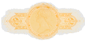
Type C features the head of Washington facing left. It is known printed in orange, pale red (a sort of pink), brown, and green (one copy only). Several instructive legends were used with it.
|
C1 is known in different shades of orange. A common shade is salmon, a dark orange that sometimes mistakenly leads the imprint to be classified as a C5, which is printed in a pale red.
C1a is an unusual and rare item. It consists of a receipt with a C1 imprint and the wording, "Good when used as a receipt for payment of money" running up the left side. In this case the instructive clause was added by the printer, not American Phototype.
C2 is the basic imprint in brown.
C5 is the pale red version.
C8 is printed in green.
C9 is the first listed Type C with an instructive legend, "Good only for sight draft," printed at the lower right.
C11 contains the same legend as C9, but the imprint is brown and the legend is at the lower left.
C13 is the same as C11 except printed in orange or salmon.
C15 bears the instructive legend, "Good only for receipt for money paid," at the lower right. The receipts it appears on are extremely rare items, with two used and two unused copies known.
C16 involves the same legend as C15, but printed at the lower left.
|
C17 bears the legend, "Good when issued for the payment of money," in one line at the base of the stamp.
C19 has the wording "Good when issued for the" and "Payment of money" in two small boxes to the left and right of the imprint, respectively. It is uncommon when used on one side of a receipt, but William Topping and Company kept books of them with the revenue printed on both sides, so this version (C19a) is much more common.
C21 includes the instructive legend in the design of the imprint itself, with "Good only for bank check" split in three bands across the design.
C21a is the inverted version of C21. This is not an inverted stamp in the same sense as one where one part of the design was printed upside down in relation to the rest of it - here the printed check paper was fed into the press the wrong way when the imprint was printed. The proper tax had been paid, so there was no reason to reject the item or not use it.
C21b is a C21 with an orange-red Nevada state revenue printed on top of it. Several mining companies in Virginia City, Nevada used checks with this imprint.
C21c is a C21 found on the back of the check, inverted.
C22 is the same design as C21 but printed in brown.
C22a is the version of C22 printed on the back of the check, inverted.
C26 was designed for certificates of deposit, and bears the legend "Good when the amount does not exceed $100" in a tablet at the lower right.
|
Type D |
|
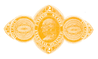
Type D includes a portrait of Benjamin Franklin facing left.
It can be found printed in orange, brown, buff and red. Several instructive legends are known to have been used with it. |
D1 is the orange version. Besides checks and drafts the imprint was used on time drafts that look like currency, and mining scrip that was printed but never used.
D1c is the same imprint, but inverted in relation to the check face.
In this case the imprint would have been printed first, so the otherwise blank paper was inserted into the press the wrong way when the check was printed.
Type D is also known printed on the back of the check, but no copy is available for illustration at this time.
D3 is a true brown color. |
D4 is buff in color, and is what was once known as "brown". Buff is much more common (the catalog value is roughly one-hundredth
of D3’s), but copies are often found being marketed as D3s.
D5 is red. Only eight copies are known to exist.
D7 contains an instructive clause in two parts, "Good only for" and "Bank Check" as part of the design.
D7a is the same design, printed on the back of the check.
D8 features extra wording at the lower right, "Good only for bank check" in two lines. It is only known on checks or drafts from three users. No unused copies are known.
D9 has the words "Good only for sight draft" in two lines at the lower left.
|

Type E |
|
Type E also features Franklin, but in a rectangular frame. It is known in orange and brown. Several instructive legends were used with it. |
The listing order for Type E is unusual in that the first is item is E2, which is the rare brown version of the imprint.
E4 is the standard orange imprint with no clauses.
Corners tended to break off the E4 die, and there is a catalog listing for broken dies at lower left or right, but the listing does not have a separate subtype lettering. This copy, on a United States Cartridge Company check, has a blunted lower left corner.
Close examination shows that such broken corners on checks of different users are not the same. |
E4a is the designation given to a double impression of Type E4.
E5 has the instructive legend "Good only for sight draft" at the base.
E6 is similar to E5, but the legend is "Good only for bank check." Only one copy is known.
E7 incorporates the wording "Good only for bank check" into the design of the imprint.
A double impression of E7 exists, E7a. |

Type F |
|
Type F is only known in orange, and without instructive clauses. It was the last design offered by American Phototype, after the clauses were no longer necessary. It consists of Franklin in a rounded frame with numerals at the sides.
|
|
F1 was used on checks and drafts, but is not known on other financial instruments.
If the imprint is inverted in relation to the check face, it is an F1a.
|

Type G |
|
The imprint listed as Type RN-G was used later than types H through O, but it will be discussed first to follow the order of the Scott listings.
Type G became the only imprint authorized for production in late 1875. It was the product of the Graphic Company of New York, and featured Liberty looking right inside a diamond-shaped frame. It has no instructive clauses, no colors other than shades of orange, and is not listed as an invert or double impression. It is the most common of all Civil War imprinted revenues and was used from 1875 until 1883, when the check tax was repealed.
|
|
The initial products of the Graphic Company included their name in very small letters running below both sides of the diamond design. These are cataloged as G3. The signage was removed quickly, most likely because the government objected to the free advertising it provided.
The imprint without the printer's name is listed as G1. It can be found on checks, drafts, voucher checks and passbook receipts.
G1 can be found on the backs of checks, placed there intentionally. If printed right-side-up the listing is G1a, and when upside-down in relation to the face of the check, G1b.
|
The tax on checks and drafts was no longer effective as of July 1, 1883. Owners of unused imprinted checks were offered a limited time to send them in for a refund of the tax. The checks were stamped "stamp redeemed" in a violet color and returned to the purchaser for later use. Redemption clauses were to be applied reading upward, but can be found reading down or horizontally. Here are several examples.
|

Type H |
|
Scott Types H through L were printed by Joseph R. Carpenter of Philadelphia. Butler & Carpenter were printers of adhesive revenue stamps, and in early 1866 the firm was awarded a contract to imprint revenues. Butler died during the period, so the printer is listed simply as Carpenter in the catalog. The firm's first deliveries were made at the end of June, 1866. Designs H through J were engraved, while K and L were produced by letterpress.
The first Carpenter listing in Scott is Type RN-H, although the RN-I designs were offered earlier. The H imprint features an eagle in a circular frame. Shades of orange are the only colors known, and the only instructive clause not provided by a check printer is not known to have been used.
|
H3 was introduced in April of 1867.
H3a is the number given to the imprint when it is inverted in relation to the text of the check.
Several H3 documents with noticeable double impressions have been found. They have their own catalog number, H3b.
A number of documents with H3 imprints have instructive clauses added by the document printer rather than by Carpenter. The first group includes receipts. These are given minor numbers from H3c through H3i, distinguished by the wording in the clauses, their position on the document and their color. In addition, one number is assigned to an inverted imprint on a check with an added clause.
|
H3c is the number for H3 documents that have a seven-word clause, "Good when used for payment of money", added below the imprint in black.
H3d refers to H3 documents with a ten-word clause, "Good when used as a receipt for payment of money", below the imprint in black. H3e has the same ten-word clause running up the left side in black, and H3f has the clause at the bottom, printed in red.
H3g receipts contain an eleven-word clause, "Good when used as a receipt for the payment of money", printed in one line in black. H3h is the same, but with the imprint inverted. The clause is printed in two lines in black on H3i receipts, and in violet on H3j receipts. H3k, with the clause in two yellow lines below the imprint, appears to have been used only in Colorado.
H3l has a twelve-word legend, "Good only when used as a receipt for the payment of moneys", added in black.
H5 is only known as a proof. The design features "Good for check or sight draft only" curving on either side of the imprint, printed by Carpenter rather than added by a check printer.
H6 has quite different wording. "Good for bank check or sight draft only" is printed across the upper part of the revenue in small black type. This clause was added by the check printer.
|

Type I |
|
The RN-I imprints were the first that Carpenter produced. They were the designs of the adhesive bank check and USIR stamps printed by the firm.
|
|
I1 is the bank check stamp design. It was offered for
approximately eight months, but instruments bearing it are not at all common.
The design for I2 was similar, but modeled after the U. S. Internal Revenue two-cent stamp. It was printed for one month in 1867.
|
Type J |
|
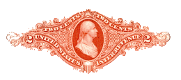
Carpenter introduced RN-J in 1872, while continuing the production of H3. J exists in two basic forms: one with a bust of Washington in a solid-color background surrounded by a fancy, broad frame, and the other with the same bust in a partially shaded background. It is known in shades of orange and red.
|
J4 is the listing for the solid-color background version, printed in orange.
The checks of several users have been found with J4 double impressions. The catalog number for these is J4a.
J4b is the numbering given to one user’s checks that have "Good only for bank check or sight draft" printed vertically in red
at the right side by the check printer.
|
J5 is the same design as J4, but printed in red, which is actually a vivid red-orange.
A double impression of J5 is also known, which is given the designation of J5a.
J9 was thought to exist only as a proof until fairly recently. It consists of the J4 design with "Good for check or sight draft only" curved in small letters below it, added by Carpenter rather than the check printer.
J11 is the second design, with partial shading below the bust and to its left.
|
Type K |
|
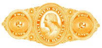
Carpenter introduced Type K in 1873. It features Washington facing left in an elaborately-milled frame, and was printed by letterpress. The design is known in various shades of orange, red, gray, brown, blue and olive.
|
Numbering starts with K1, which is blue. This number has been restored to the catalog quite recently, having been deleted for lack of a recorded copy some time ago. One used copy is now known, along with a cut square that may have come from a sample or may have been cut down as a safety measure when given to a collector.
K4 is gray.
|
K5 is printed in brown. The shade is rather reddish on the copies I have seen.
K6 is orange, the most commonly found color.
K8 is the red type. After the listing in the catalog there is a parenthetical expression, "(shades)". The imprint is found in red shades close to brown, pinkish red, and a pearl shade with some pink in it. It is the least common color for Type K.
K11 is olive. To some extent, any Type K that isn’t readily identifiable as to color seems to end up being classified here. |

Type L |
|
Type L is the last of the Carpenter designs, featuring a bust of Washington facing left, as in Type K, but with a smaller frame. It is known in blue, turquoise, gray, green, orange, olive, red and brown. The design was approved for use in 1874.
|
L1 is blue. Oddly enough, no used checks or drafts are known with this color of imprint.
L2, turquoise, is a recent addition to the catalog. It was previously considered to be a shade of blue.
L3 is the imprint in gray. It is known in deep gray as well as a very pale shade.
|
L4 is green. "Light green" is mentioned in the catalog, and even given a lower price. Several shades exist, from almost yellow-green to very deep green.
The orange variety is L5.
L6 is olive. The catalog shows different values for olive and gray olive.
L10 is listed as red (more like pink), and L10a as violet red.
L13 is the imprint in brown.
|

Type M |
Alexander Trochsler & Company of Boston is known to have printed RN Type N, and most probably followed this up with Type M. To remain in Scott Catalog sequence they will be discussed in reverse order of their use.
Type RN-M cannot be directly traced to Trochsler, but the circumstantial evidence is strong. Among other things, there are a number of checks that are identical except that an N imprint has been replaced by an M imprint. The design shows Washington in a modest frame, which was used again for tinfoil and paper chewing tobacco wrappers and the Spanish American War imprinted revenues. The imprint is known in orange, green and gray. There are no instructive clauses.
|
M2 is the imprint in shades of orange.
|
The Lawrence Manufacturing Company issued many dividend checks, and was lucky (?) enough to have had three imprint types inverted on those checks. When they began to use Type M several were unintentionally printed with the design on the back of the check, inverted. These were given the catalog number of M2a.
M3 is the green version of the imprint. It is known on the drafts of one user, the Citizens Savings Bank of New York.
M4 is the design in gray. It was also used by the Citizens Savings Bank of New York, but the only copies known are dated in 1914. On a number of them, the person who signed as Assistant Secretary in 1876 also signed as President in 1914. These are scarce.
|
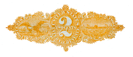
Type N |
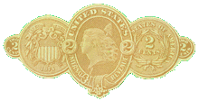
Type O |
|
Type RN-O is the only imprint produced by Morey and Sherwood of Chicago. The design is that of the head of Liberty flanked by the sides of a two-cent coin. Approximately 107,000 were printed on various checks, and fewer than 100 of these are known to exist today. |
|
All known users are from Illinois, Iowa, Missouri or Wisconsin.
O2 is the only entry in the catalog for Type O.
Here is a short article showing examples of all the Type O checks currently known.
|
|
This is a brief look into the fascinating world of revenue stamped paper. It can be collected by type, geographic location, user, or vignette. There are imprints with higher values for certificates of deposit, bonds, stocks, agreements, insurance policies, and other documents taxed more than two cents (Scott Types RN-P through RN-W). There are facsimile designs used for a number of years after the tax was abolished.
Documentary taxes were reinstated in 1898 to assist in funding the Spanish American War. A new imprint design was used in connection with these taxes, Type RN-X.
|
|
If you are interested, you may want to check out (pun intended) the website of the American Society of Check Collectors. Articles featuring revenue stamped paper are often contained in The Check Collector, the quarterly magazine of the ASCC.
Another magazine which contains articles on revenue stamped paper is The American Revenuer, the quarterly publication of The American Revenue Association. Membership information is available on their website.
There are inventories of some of the rarer imprints accessible from my home page.
Bibliography:
Specialized Catalogue of U.S. Stamps and Covers, Scott Publishing Co., Sidney, OH
Field Guide to Revenue Stamped Paper, seven paperback volumes, Bill Castenholz, Castenholz and Sons, Publishers, Pacific Palisades, CA
Handbook for United States Revenue Stamped Paper, Joseph Einstein, Thomas C. Kingsley and W. Richard DeKay, American Revenue Association, Inc.
This site was authored by Bob Hohertz. I can be reached using this e-mail link.
| |
|